Wickes Reviews and Q&A User Interface Design
User Research | Wireframing | Prototyping | User Testing | UX Design | UI Design |
Project Scope
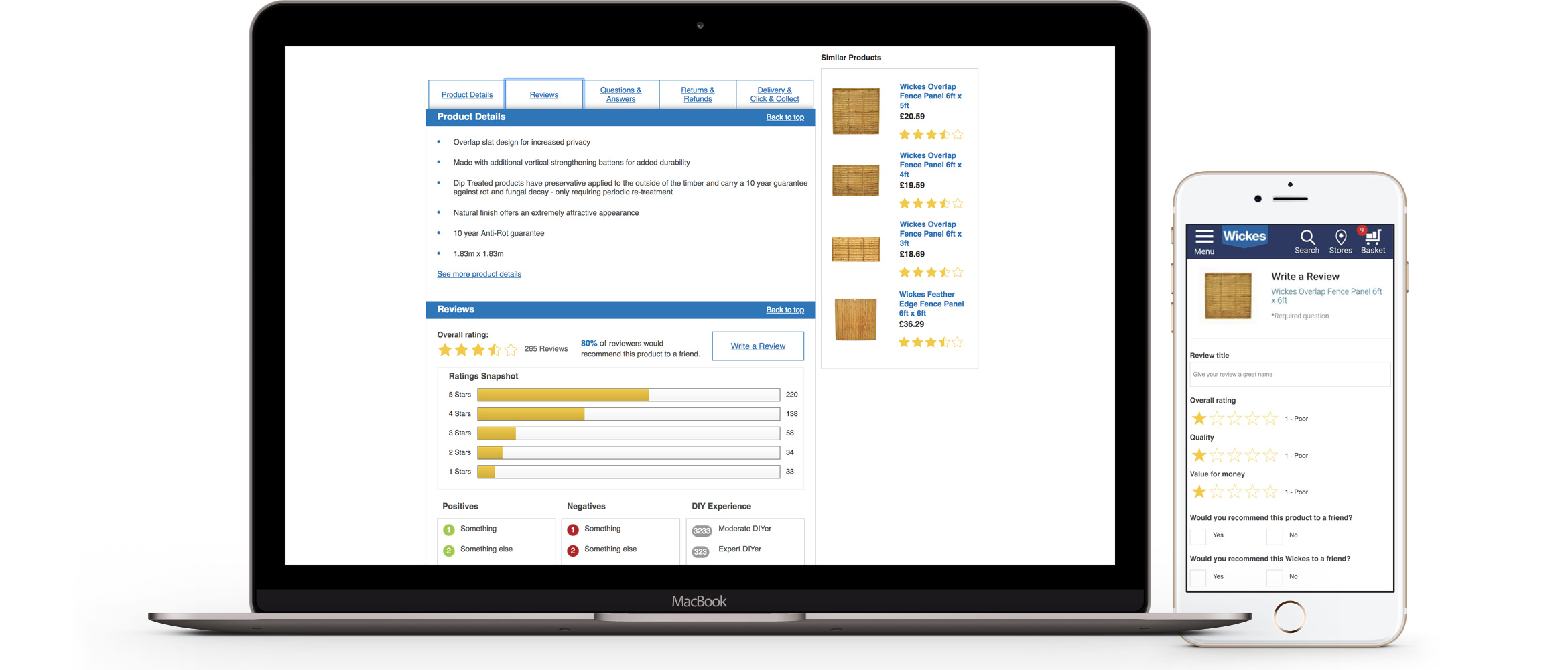
Wickes made a change to their reviews provider in early 2017. The new platform came with new out of the box functionality that wasn’t previously available with the old provider. This gave us the unique opportunity to create a brand new experience within reviews and bring in a much needed question and answer feature into the product listing pages.
Challenges
The new platform, as well as having new features that would improve the experience, also wasn’t quite as customisable as the previous platform. This gave us the challenge of having quite a fixed framework to work with. Unfortunately the new reviews platform was implemented and made live on the website without any thought of how it would look within the product details page so we wanted to create the designs and get sign off as quickly as possible.
Goals
To increase the amount of reviews received online and to improve the user's experience when choosing a product by incorporating question and answer functionality. To increase brand trust by making reviews and Q&A’s more visible and accessible.
Process
We had initially created new designs with the old reviews service provider in mind so we had a base to work from before a new reviews platform was chosen. We gathered all of the data we could on how customers interacted with product reviews (unfortunately it wasn’t plentiful) and got as much insight as we could from members of the insights team and reviews moderators. Research was done on other companies who used the same platform that we were going to be using to see what was possible.
We decided to design to design 3 versions: good, better, best. We would obviously aim for the best version to be used but we had to cover our bases and avoid having to scale our designs back at the last minute. There wasn’t budget for usability testing so we put prototypes in front of as many non-digital Wickes employees as we could to gain some insight on how it would be used. The final designs would be multi variant tested once complete and then iterations would made if pain points were discovered.
The Results
Unfortunately, after trying endlessly to get sign off for months on the new designs until my contract ended in October 2017, the company decided to go for an MVP approach based on my designs with just a slight re-style of CTA buttons, review stars and review layout. Despite having built in functionality for Q&A, this was also never implemented.